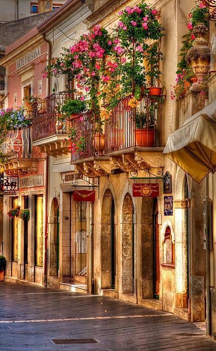
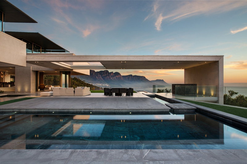
Well as my impending move to warmer climates draws ever nearer, and the projects that I am about to embark on seem to loom larger on the horizon, my thoughts on design have changed somewhat. I must admit that after 28 years in the design industry I do find myself somewhat confused as to the end product that I want to produce. So how people with no design input achieve such great spaces and homes is still a bit of a wonderment to me. I get drawn from one style to another, I like this, that's what I want, I like that I could do that, wouldn't that look fantastic I'll do that. It's a bit of a mindfeild (sic). But then I remember that you have to go with what 'you' feel is inherently right for you. This calms me down a bit, and once again I start looking at styles , themes and ideas all over again. I have found my blog to be the most useful place to visit, as I travel back through all the previous posts. So i hope that because you are here, you too will be inspired and take some of these ideas on board when you start your renovation or new build. Cut and copy the images you like and put it in your own file, for easy reference. And please share the site so that as many people can get to see some stunning spaces all in one small condensed place. Enjoy.
I've found a relatively cost effective ( read cheap) way to line walls so that you can achieve this look. By using Hardi panels, it looks fantastic.
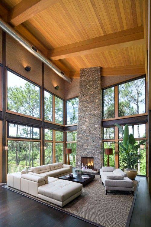
Love the timber up the walls.
Most of the houses in the blog are container homes, some are obvious as this one, but others are less so. See if you can tell which are which.
I love the rawness of concrete, it's such a natural product and not as cold as you would think.
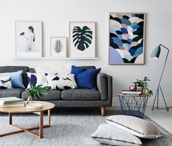
Art is vitally important to a space
Hang it or leave it leaning on the wall
Love the tones in this space
Cool front door
Coffee in the morning is vital to get inspired
Isn't this fantastic, it's not me but I love the color
9 weeks to go
Nice idea
This is a container home, I was going to leave you to guess but I really dig this place
Wow!!!!
I've always been a real fan of height in a space.
New York Central park
I don't like this, a good lesson on what not to do. If it was a graphite grey then it would look worlds different, but as it stand, this is no.
These Bonsai plants do actually float through the use of rare earth magnets, how cool is this. I intend to get very into bonsai in the next few years, I've always loved the detail of it.
Tonally just about perfection
Check out this church renovation, the best I have seen.


I do like black and white spaces
Now this is just so well considered and the quality of the space just shines through.
There is a definite black and white theme in the weeks blog.
Never be afraid of color.
Sometimes it pays to look up from your daily life
A container pool!!!!!
And there you go, the latest missive from me about design. Hope you enjoyed it and keep you eyes out for the next episode. Please share with as many as possible, I do enjoy putting these imaged together for you. have a great week and catch you all again soon.


