This is an amazing shot, its the gap between the American and European earth plates.....just worth looking at I thought
I wish
Keep it simple really is the best way to go, dont get involved in dressing and 'frippery'
Just a hint of colour thats all you need
Very cool house, we could all live in places like this, who needs that pavalova and 3/4 acre?
Again the simple elements of design seem to create something more than what is there
Same house again, it's actually quite hard to design simplicity into something
Just a calming place to live I would have thought
Just a cool place to live
Simplicity again and art, you need art in your lives
have a look at the finishes here and count how many are used
Another nice shot
I could do that
Interesting colour
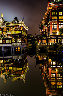
And tofinish this week a great digital shot, always amazed at how much colour saturation can be achieved.
That city again, what shots we get from here, the post man must get driven crazy in a place like this
Now is this a bit of you? I love places like this. pity I dont get to spend time in them
I could.......
no really I could
And just for a wee plug this is a Planet Design job we did a number of years ago, I always liked what our design team did here


No comments:
Post a Comment