Welcome to this weeks blog, and to all the new followers as well. This will be the first week for a few of you, so here is my blog full of images showing some great architecture and interior design as well as images that are ( in my opinion anyway), just beautifully taken showing some amazing scenes from around the world. So enjoy
I wonder how long it took to carve this
This looks like stained glass gone wrong but when you look at the next image you begin to understand what it is of.
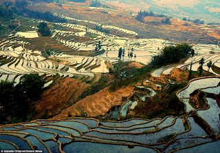
Terraced rice feilds at sunset, just a different angle and a change of light can transform the ordinary into somehting quite spectacular
I liked this image for one thing......the rope art work on the front wall, so simple and easy to do and yet so effective. You could spend a couple of hours in your workshop and do this so easily, all it needs is the inspiration and the thought "I can do that".
You all know how I feel about art, and scale a perfect example here
Timber is coming back, you read it here
Beautiful house, beautiful light
just love this space
What a great bathroom
Again great light
Quite stunning don't you think
The central atrium of the house creates a great feeling
Now that is a view......
Loved the lighting in this room, it certainly creates a mood tha just makes me want to shake up a cocktail for sure
Didn't like the space that much but loved the art installation on the rear wall
This is me..................
And this........this is the type of space that I really like, hard, bright, and plenty of height
Very cool back yard. I've featured a few on the site, but every now and then a great one comes along, this one and the one i showed built in layered circles are my two favourite ones
Great set of stairs
Again space that I like, that wharehouse feel, simple and yet very cool
Great photo
Awe, this cracked me up......a pack of wild dogs attacking a baby
Some designerson TV love to talk about indoor outdoor flow( and I roll my eyes yeah yeah fluff another cushion), but this is a perfect example of it........I might start listening a bit closer now
Cool space again, I keep using that word but it just is!!!!!
Remeber last week in order to create stunning design take something out, there's only 3 things in this image and yet it looks so complete
Again so simple, check your own space and see if there is somehting that does not belong there, less clutter is the call of the day
I also like white spaces, but the little artwork sitting on the table is just great!!!!
And then you have interiors like this........
And this. BTW the scale of the art, did you notice it
Something must have got caught in the photocopier, just amazing, can you imagine the contractors meetings over this.
I liked this room
And I love this, I want to be there now......
simple and elegant
This is a bar in Boston, a friend of mine has just been there and said " you have to see this place', and funnily enough up pops an image of it. Loved the photo just for the photos sake, but the content is pretty great too
I actually removed this image when I loaded up for the weeks blog, but I kept coming back to it, what do you think
Now this is an interesting set of images, the designer did not want a lot of colour so decided just to introduce 1 ( mustard) right throughout the house in all the rooms and I think it's pretty clever actually
So so simple
Notice all the spaces are black and white just the single element
very good idea
And then we have balance throughout
Just to finish off this week, i do favour Black and White images sometimes they jsut add a mood to an image.
Well thats all for the week, as I said to the new visitors I hope you enjoy the blog, please go back through the blog there are some amazing things to see. And remember if you want to see larger images just click on them, they will open on a new page, so all you see is the picture and not my ramblings.......
Enjoy


No comments:
Post a Comment