I love clever furniture that not only looks great but works.
Now who says meeting rooms have to be closed off from the rest of the office. Although not too sure about the ceiling tiles, but I guess it was their brief, so good on them for 'breaking out'.
I thought this window treatment was pretty cool
These pods seem to be gaining some traction in the open plan environment as a useful tool for those who need to get some serious concentration in.
But offices don't need to be boring either, with the right twist they can become very nice places to be.
Oh the work, oh the work, imagine the joiner scratching his head at this, and the cost!!!!
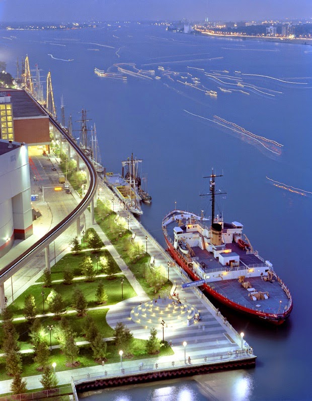
Lake Como.........wanna go?
This house designed over 40 years ago, looks as about as contemporary as you could possibly get. Always like the way the designers of the time turned steps into low seating for the hip and the cool to lounge on.
See don't throw anything out, what is one mans junk is another's treasure, how cool does this work in there?
Another interesting idea, personally I'd put wheels on it so that you could move this as the office changes
Now isn't this just a place you'd love to come home too.
Old and new can sit side by side quite comfortably
This does not work for me, it's color used for the sake of using color.
But here the concrete and the timber seem to work very well together.
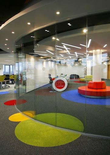
Going open plan requires a balance between the office and the facilities that support that office.
I'm really starting to like Lake Como, stupidly I rode right around it when I was there and did not stop.
Stunning stairs, that you couldn't build here, due to regulations. Pity don't you think?
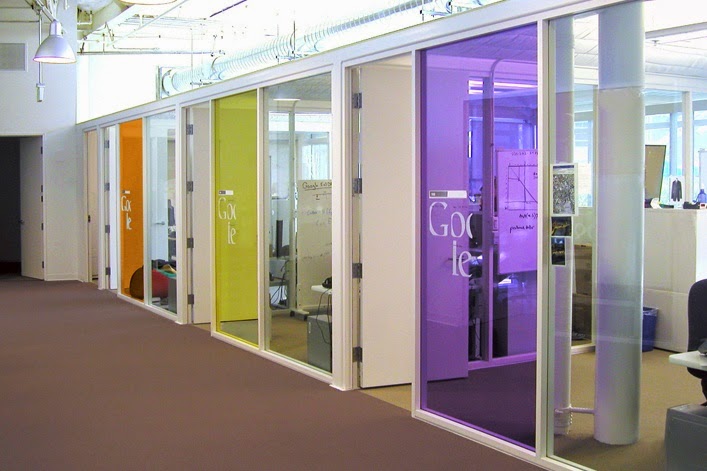
I wonder if the people from Google can't find anything in their office, how many times a day would you hear "just Google it".
You do have to be very careful sometimes though.......
By now you all know my love of libraries, I wish we had these here.
Buddha does that to a space don't you think?
My guess is someone likes it.
Hmmmm.......................I wish
Staggered seating to give more room, what a great idea.
I really liked the idea of putting the small personal meeting spaces down this corridor, great use of space I thought.
Hotel design is right up there when it comes to pushing boundaries, you just have to go that 'one' step further to make your point of difference, and doesn't that just make you feel so nice?
Art can make or break a space, don't be afraid though.
I like it, but a bit too sterile for me, give me some color.
Hmm yes well sometimes it works and sometimes it doesn't, this looks like a kitchen from one of those design and build your home in a week programs. Sorry but can someone make the sound of the buzzer from what's my line.
Now this is nice
You know I'm about detail
The use of the lightweight bulkheads is quite interesting
Just plain old sharp, does it for me every time.
This is a western take on a Japanese theme of overnight stay hotels, except this is much nicer
Nice don't you think, this idea could work anywhere, even in your modest old Bach or in your children s rooms.
Open plan is not necessarily about straight desking either. here we have a desk that is over 150 meters long that wends ( I like that word ) it's way through an entire floor, and I think the result is very nice.
Thought that this image was fantastic, all about 'horsing around'.
I've often wondered if these alpine goats get themselves into a spot so tight that it is impossible to turn around and get out. Does a goat make a sound if it falls off of a cliff and no one is around to hear it?
Well there you go. That's this weeks installment for you. Hope you all saw something that has inspired you or given you an idea to do something. remember to look back through the archives occasionally, you never know there is always something in there to make you stop and think 'what a wonderful place we all live in'.


No comments:
Post a Comment