Welcome to this weeks installment of the Planet Design Weekly site. My god the days are screaming by that's for sure I don't want to frighten you but it's only 127 days till Christmas and whilst I can't be sure I'm pretty sure that I saw a reference to Christmas last week in the newspaper. Now that is scary.
So what does this week bring us, well an eclectic collection of images, buildings, holiday locations, office interiors, design 'things', and some beautiful images of stuff that are just nice to look at. nothing more, and fewer words, so here you are, just for you to enjoy.
I thought this quite clever, it didn't need to be a pot plant shelf it could have easily been a bookshelf, or a clothes rack too. Simple and nice.
A different way of looking at open plan
For some reason I find myself looking at great kitchens at the moment, must be because of the conversations I'm having with friends currently.
pretty nice bathrooms seem to be a feature as well.
Clever little design
Nice open plan here, I think the difference in flooring materials between the working space and the open corridors is very good, must remember that purely from a point of serviceability.
A stunning container home
Lovely light
We did offices like these for DIA about 15 years ago, what goes around come around.
This is a winery in the south of Spain, I love the way the Spanish while adhering to their traditions, are able to go way out past the norm and do stuff like this. It really defines them as a nation I feel.
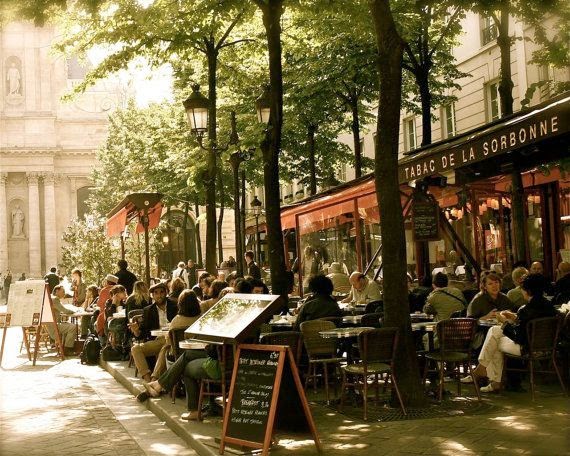
I can taste the coffee smell the aroma of little thin cigarettes wafting through the air, and feel the warmth of the Paris spring on my back.
Great meeting space in modern office
remember texture and layers
I'm amazed by what's happening around the world at the moment and this image really bought it home to me, this is so sad.
Now this is clever design, I laughed and laughed when I saw this, how clever is that. A great way to stop kids from stealing your kids sandwiches.
Cool kids space
Love the way the kitchen is lit, set back, in and down from the living area, and the height of the space is brilliant.
What place couldn't be without some nice little morsels eh?
Hmm, not too sure about this open plan still needs meeting spaces and meeting rooms, but don't know if this works for me, I'm guessing that i would need to see and hear the design brief to see how this was formulated and conceived.
This is great!!!!!!!!!
A beautiful house
beautifully made
beautifully built
A beautiful result
This image got me to thinking "yeah, why do we hang pictures on the walls", it's not really necessary is it?
I'm a fan of that seventies look, it's so never out of date.
This looks like a very normal very average house until you see it from a different perspective
And it reveals itself to you as being something considerably more than what it is.
And then the interior just smacks of quality
What a beautiful warm space, perhaps a bit devoid of color but otherwise just simple, it's that old saying 'less is more'. And this house is exactly that.
A great image, and a great way to finish this installment. Hope you saw something that made you stop and think, hope you enjoyed it.


No comments:
Post a Comment